6 The mathematics of responsive design
Responsive design is presented as a problem of adaptation grounded in math. The chapter frames layouts as systems that adjust using ratios, percentages, proportions, and conditional logic so text stays legible, images scale without distortion, and components reorganize fluidly. It emphasizes what modern layout tools already provide—Grid’s fractional tracks and Flexbox’s grow/shrink/wrap—while explaining when explicit rules are still needed. Media queries are treated as mathematical comparisons, with clear guidance on min/max feature expressions, the modern range syntax for cleaner multi‑condition rules, and practical tips to avoid overlapping breakpoints and to keep units consistent.
The discussion then focuses on proportional layouts built with relative units. It explains how percentages resolve against parent dimensions, how nested percentages compound, and how calc() mixes flexible and fixed values. A step‑by‑step method converts fixed designs to liquid ones: set a sensible max-width, compute percentage widths and spacing from original pixel values, and let the layout scale. To size elements relative to the screen, the chapter introduces viewport units (vw, vh, vmin, vmax) and their logical variants (vi, vb), details the long‑standing 100vh mobile overflow pitfall, and shows how the newer small, large, and dynamic viewport units (sv*, lv*, dv*) address browser chrome, with advice on when each is most appropriate.
Finally, the chapter shows how CSS math functions—calc(), min(), max(), and especially clamp()—create smooth, fluid behavior without jumpy breakpoint switches. It demonstrates deriving clamp’s preferred value via linear interpolation so widths, margins, padding, and gaps scale predictably within bounds. When CSS alone isn’t enough, JavaScript enters for complex conditional logic, runtime calculations, and responsiveness to user interactions or live data—for example, allocating space proportionally to widgets based on dynamic weights. The result is a toolbox for building resilient, accessible, and maintainable responsive interfaces powered by clear mathematical reasoning.
The fixed-width hero image looks good on a desktop.

The fixed-width hero image requires a slight scroll on a tablet.

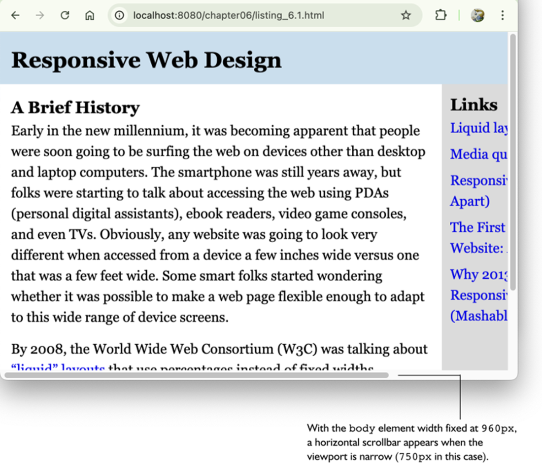
The fixed-width hero requires a huge horizontal scroll on a phone.
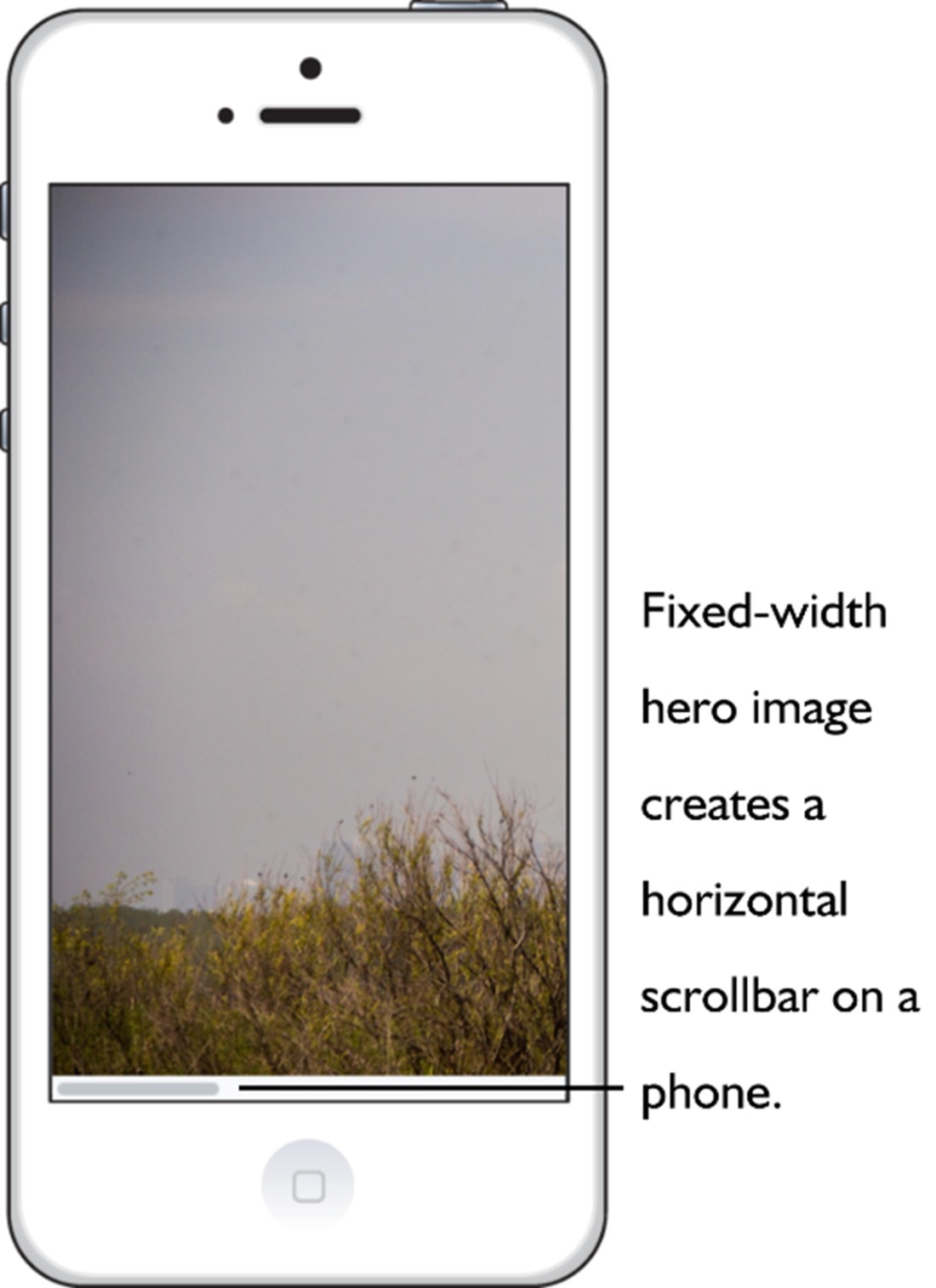
A fixed-width layout isn’t adaptable to different screen sizes.
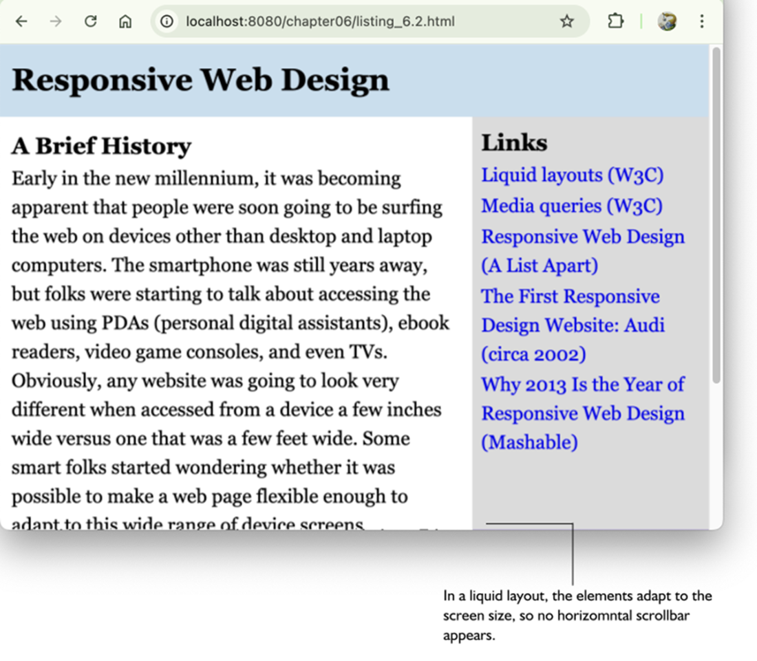
The same page from figure 6.4, now with a responsive liquid layout.
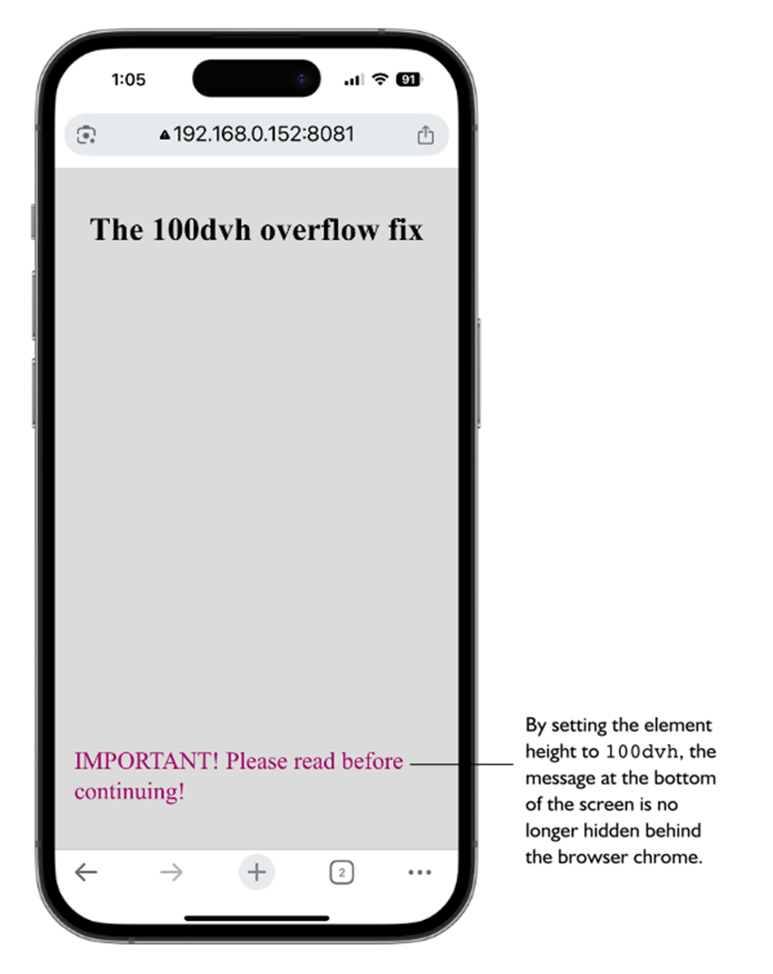
The 100vh overflow bug can cause important screen elements to be hidden behind the browser’s chrome.

Setting the .fullscreen element’s height to 100dvh solves the overflow bug.
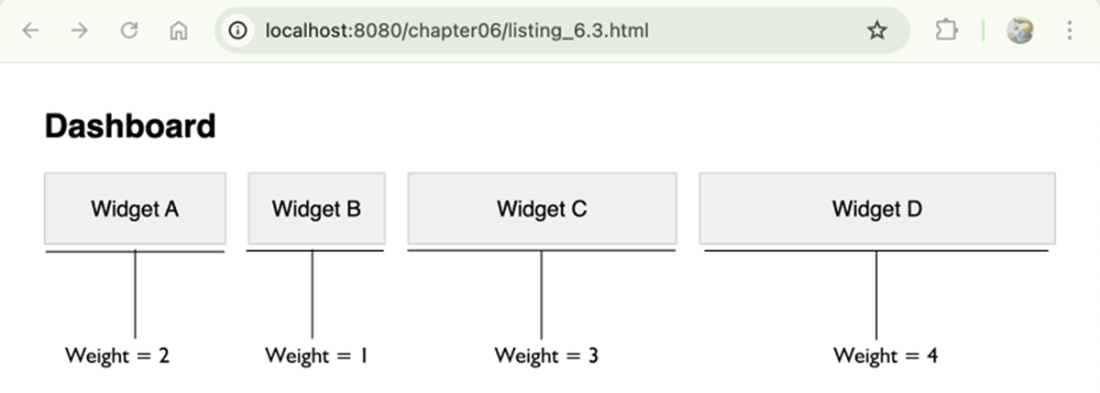
Dashboard widgets where the flex-basis was calculated dynamically via JavaScript.
Summary
- Responsive design is about adaptation, where a layout adapts itself to the current screen size and device features.
- Fixed-width layouts are almost always a problem on mobile devices because once the screen width is less than the fixed-size width, the user must scroll horizontally to read the page.
- Grid and Flexbox offer responsiveness right out of the box, but you might still need extra CSS properties to ensure your layout adapts properly to all screen sizes.
- The media query range syntax is well-supported and should be used unless you need to support legacy browsers.
- When using percentages, remember that with both horizontal properties such as width and padding-right and vertical properties such as margin-top and padding-bottom, the percentage is relative to the width of the parent.
- To create a liquid layout based on percentages, deciding a maximum width for your layout, determine the percentage widths to use for the rest of the elements, then apply the same formula to any other spacing-related items that are part of the layout, such as margins and padding.
- The standard viewport units vw and vh are fine in most cases, but consider using newer units such as svh and dvh if you want more control over your layouts.
- When using clamp(), you can calculate a length for the preferred value using the linear interpolation formula: (maxValue - minValue) / (maxVW - minVW) * 100.
FAQ
What does “the mathematics of responsive design” really mean?
It’s about expressing layout behavior as relationships and rules: proportions, ratios, and conditions. You ask: How does this element relate to its parent? What should change as the viewport grows or shrinks? Can I encode that with formulas (percentages, viewport units) or conditional logic (media queries)? This mindset replaces brittle, fixed values with systems that adapt predictably.Why use width: 100% and height: auto for images?
Settingwidth: 100% lets the image scale to its container, and height: auto preserves aspect ratio to prevent distortion. The result: the image fits phones, tablets, and desktops without causing horizontal scrollbars.If Grid and Flexbox are responsive, when do I still need media queries?
Use media queries when the rules must explicitly change with viewport size, such as switching multi-column to single-column layouts, adjusting paddings or gaps on large screens, revealing or hiding navigation, progressively enhancing a mobile-first design, or dialing down animations on smaller or constrained devices.How does modern media query range syntax work (and what are the fallbacks)?
Range syntax lets you write concise comparisons:@media (600px <= width <= 1024px) { ... }. It supports <, <=, >, and >= with width or height. For older browsers, use Boolean syntax: @media (min-width: 600px) and (max-width: 1024px) { ... } or comma-separated lists for OR, and not for negation.How do I pick breakpoint units and avoid overlapping rules?
- Use consistent units (stick topx or em). Using em ties breakpoints to font size, which can help accessibility.- Avoid overlaps: prefer pairs like
(max-width: 767px) and (min-width: 768px) instead of both at 768px.- Verify in dev tools by resizing and watching which queries activate.
How do percentages resolve in CSS (and what’s the vertical-percentage quirk)?
- Width-related properties resolve against the parent’s width.- Top/bottom margins and paddings also resolve against the parent’s width (not height)—a long-standing CSS quirk.
- For heights, percentages work only if the parent has an explicit height; otherwise they resolve to
auto/0 depending on context.- For absolutely positioned elements, percentage offsets are relative to the containing block.
How do I convert a fixed-width layout to a liquid layout?
1) Choose a sensiblemax-width for the outer container to cap line length.2) Convert fixed widths to percentages with:
percent = (elementWidth / parentWidth) * 100.3) Convert spacing (margins/paddings) similarly so gutters scale. Example: if an article was 640px inside a 960px container, use
width: 66.67%; padding of 16px becomes (16 / 960) * 100 = 1.67%.What are viewport units, and how do I fix the mobile 100vh overflow issue?
Classic units:vw, vh, vmin, vmax reference the viewport. On mobile, 100vh historically included browser chrome, causing initial overflow. New units solve this: svh (small), lvh (large), and dvh (dynamic). Use 100svh to avoid initial overflow under visible UI, or 100dvh to always match the live visible height as toolbars show/hide.How can I make layouts fluid with calc(), min(), max(), and clamp()?
- Usecalc() for linear relationships (e.g., width: calc(80vw)).- Use
min()/max() for limits.- Use
clamp(min, preferred, max) for smooth scaling with bounds, e.g., width: clamp(300px, 90%, 1200px) or spacing like margin: clamp(1rem, 4vw, 3rem).How do I compute the “preferred” value for clamp() from target breakpoints?
Given that a property should beminValue at minVW and maxValue at maxVW, the preferred term (in vw) is: ((maxValue - minValue) / (maxVW - minVW)) * 100vw. Example: from 16px at 400px to 48px at 1200px gives (48-16)/(1200-400)*100 = 4vw, so clamp(1rem, 4vw, 3rem).When should I bring in JavaScript for responsive behavior?
Use JS when you need logic or calculations beyond CSS: rearranging DOM based on multiple conditions, sizing elements from dynamic data (e.g., proportionalflex-basis from weights), or reacting to runtime events and content changes (e.g., interactive charts or canvases). CSS handles most responsive needs, but JS covers data-driven or stateful layout scenarios.
 Math for Web Design ebook for free