1 Web dev math fundamentals
This opening material presents math as a practical, everyday part of front-end design and development rather than an abstract academic subject. It argues that even familiar tasks—using relative units, centering elements, applying easing functions, calculating element positions, or building responsive layouts—depend on mathematical ideas. Learning those ideas helps designers and developers replace guesswork with understanding, leading to more precise layouts, smoother animations, better debugging, more adaptable interfaces, and stronger creative control.
The text explains that CSS and JavaScript both use math, but in different ways. CSS relies on declarative math through units, inheritance, layout systems, transforms, timing functions, and functions such as calc(), clamp(), min(), and max(), letting the browser compute responsive values at render time. JavaScript provides procedural, real-time math through operators and the Math object, enabling calculations for interaction, animation, randomization, motion, measurements, data visualization, and dynamic UI behavior. CSS is best suited for layout, sizing, spacing, and typography, while JavaScript is better when logic, user input, or live updates are required.
The chapter also surveys the minimum math knowledge useful for web development: arithmetic expressions, algebra, ratios, exponents, roots, linear equations, inequalities, geometry, trigonometry, and coordinate systems. These concepts appear in practical tasks such as scaling typography, preserving aspect ratios, calculating scroll progress, setting breakpoints, measuring distances, rotating elements, arranging items in circles, drawing on canvas, and positioning elements relative to the viewport. The overall message is that front-end math is manageable, highly practical, and central to building interfaces that are responsive, reliable, interactive, and visually coherent.
Why is the section heading so much bigger than the main heading? Math!
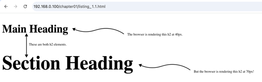
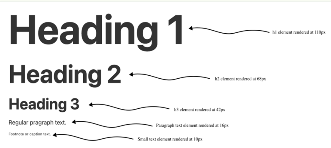
A type scale based on the Golden Ratio (approximately 1.618).
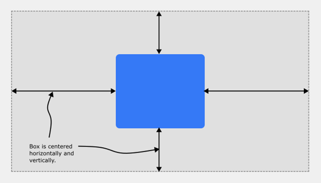
Centering an element within its containing block requires just a few CSS declarations, but behind the scenes the browser is jumping through many mathematical hoops to get the job done
Some basic geometric figures.

A right triangle and its sides relative to the angle theta (θ).

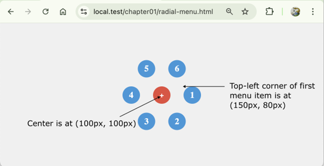
Using trigonometry to arrange menu items in a circle.
Summary
- Learning about front-end math will help you build more precise and reliable layouts, write more performant code, and debug layout issues faster.
- Mathematics in UI and UX design has practical use cases for responsive layouts, typography, colors, and spacing and alignment.
- Developers use math when coding motion and animation, layouts, and user interactions.
- In CSS, you use math to position and transform elements, scale layouts, build responsive elements, style text, and animate transitions.
- CSS provides math functions that you can use to perform basic arithmetic right in your style declarations.
- JavaScript gives you full control with dynamic, real-time math using the Math object and custom logic.
- Use CSS math for layout, sizing, spacing, and typography when the values can be determined by the browser at render time.
- Use JavaScript math when you need interaction, animation, or real-time adjustments based on user behavior or complex conditions.
FAQ
Why should front-end developers and web designers learn math?
Learning web development math helps you build more precise and reliable layouts, master responsive design faster, write smarter code, debug layout and animation problems more easily, and unlock creative design possibilities such as circular layouts, spiral animations, rhythmic typography, and ratio-based grids.
Where does math show up in everyday front-end development?
Math appears in many common tasks, including using relative units such as em and rem, applying easing functions such as ease-in-out, calculating sizes with calc(), measuring elements with getBoundingClientRect(), centering elements, creating responsive layouts, and animating movement over time.
How does math improve responsive design?
Responsive design depends on scaling, proportions, and constraints. Percentages, viewport units such as vw and vh, and CSS functions such as calc(), clamp(), min(), and max() all use math to help layouts and typography adapt smoothly to different screen sizes.
How is math connected to visual design principles?
Design depends on balance, proportion, and structure, all of which have mathematical roots. Examples include the rule of thirds, the Golden Ratio, modular type scales, grid systems, spacing units, and proportional layouts. Even setting a container’s max-width or centering an element involves mathematical decisions.
How does CSS use math?
CSS uses math to position elements, scale layouts, create responsive designs, style text, and animate transitions. For example, left: 50% and transform: translate(-50%, -50%) rely on calculations to center an element, while font-size: clamp(1rem, 2vw, 2rem) uses mathematical bounds to create fluid typography.
How does JavaScript use math in front-end development?
JavaScript provides arithmetic operators such as +, -, *, /, %, and **, plus the built-in Math object. Methods such as Math.round(), Math.random(), Math.max(), Math.sqrt(), Math.sin(), and Math.cos() are used for animations, interactions, measurements, random effects, circular motion, and data visualization.
When should I use CSS math instead of JavaScript math?
Use CSS math for layout, sizing, spacing, and typography when the browser can determine the values at render time. CSS math is declarative: you describe what you want with functions such as calc() or clamp(), and the browser calculates the result. Use JavaScript math when you need interactivity, animation, real-time updates, user input, loops, conditionals, or more complex logic.
What basic math concepts are most important for front-end development?
The chapter identifies several key concepts: arithmetic, algebra, ratios, exponents and roots, linear equations, inequalities and comparison expressions, geometry, trigonometry, and coordinate systems. These concepts support common web tasks such as calculating widths, scaling typography, measuring distances, creating animations, checking breakpoints, positioning elements, and working with user input.
What is an example of algebra in web development?
Algebra appears whenever you calculate an unknown value from variable quantities. For example, const remainingHeight = window.innerHeight - headerHeight; calculates the remaining viewport space after subtracting a variable header height. Similarly, width: calc(100% - 2rem); uses a variable parent width and subtracts a fixed amount.
How are geometry, trigonometry, and coordinate systems used on the web?
Geometry is used for points, lines, vectors, angles, shapes, paths, rotations, scaling, and collision-like calculations. Trigonometry is used for circular layouts, radial menus, wave effects, rotations, and oscillating animations. Coordinate systems locate elements or pointer positions using values such as x and y; for example, e.clientX and e.clientY report mouse position relative to the viewport.
 Math for Web Design ebook for free