10 Charts and technical analysis
This chapter motivates technical analysis by showing how historical price data becomes more meaningful when visualized and interpreted in context. Charts provide a fast, intuitive way to see trends, drawdowns, and volatility across indices and single stocks, turning raw numbers into narratives that inform timing and risk. Positioned as a complement to fundamental analysis, the discussion emphasizes that prices reflect collective expectations and psychology; patterns can recur because many participants act on them, yet context, time horizon, and market regime still matter.
Readers learn to “read” charts through core concepts: trends, momentum versus mean reversion, and the psychology of support, resistance, and breakouts. The chapter introduces candlesticks (OHLC, wicks, bodies) and common patterns such as doji, hammer, and engulfing to quickly gauge sentiment and volatility. It then develops moving-average techniques—SMA, EMA, WMA, and HMA—and moving average ribbons to assess trend strength across windows. Volatility-sensitive tools like Bollinger Bands highlight potential overbought/oversold zones; MACD uses moving-average differentials to reveal momentum shifts; and the Ichimoku Cloud integrates trend, momentum, and dynamic support/resistance on a single chart. Throughout, the text stresses that signals are probabilistic, can fail in choppy markets, and work best when corroborated by other indicators or fundamentals.
Practically, the chapter demonstrates how to compute and visualize these indicators with Python and build lightweight, interactive dashboards using Streamlit. The goal is to accelerate insight: traders may use signals for entries and exits, while long-term investors can still benefit from recognizing trend phases, consolidations, and risk points. The overarching takeaway is disciplined interpretation—combine multiple views, mind the time frame and volatility, backtest strategies, and use charts to refine decisions rather than to replace broader analysis.
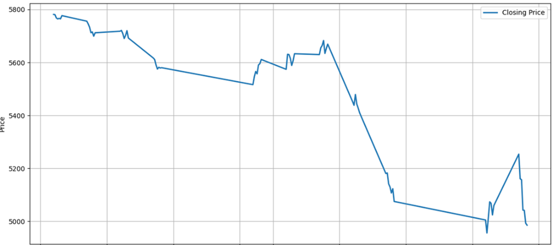
A chart without context in which we still must interpret a lot.
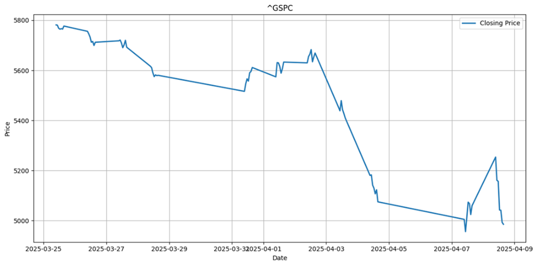
The price development of the S&P 500(ticker: ^GSPC) after Liberation Day(April 2nd, 2025), in which Donald Trump announced a fundamental change in the US tariff strategy.
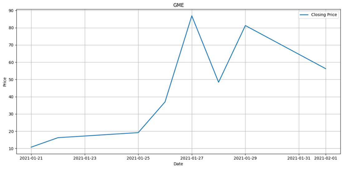
shows the extreme price development of GameStop, which is often seen as a case study for volatile share prices. GameStop is a video game retailer whose share price rose after discussions on the subreddit r/wallstreetbets suggested that the stock was undervalued. This resulted in significant losses for hedge funds that had shorted the stock.
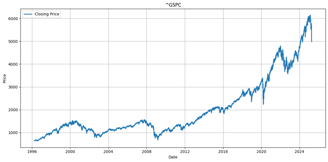
shows the S&P index from November 1996 to April 4th, which shows various crises in the past, such as the dot-com bubble (early 2000), the housing crisis (2008), the COVID-19 pandemic (2020), the assault on Ukraine (2022), and the announcement of tariffs by the US (2025).
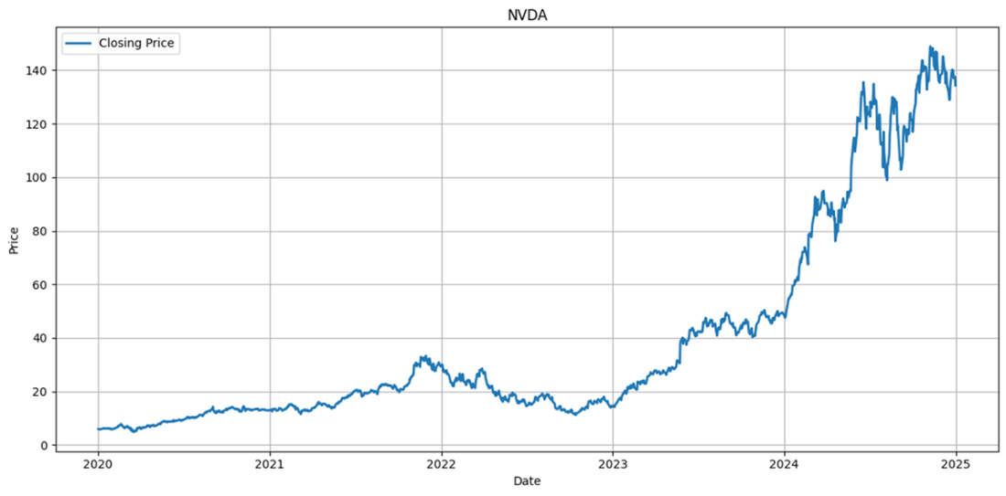
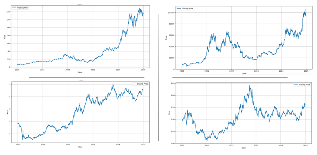
Nvidia's share price data grew by 1787,89% in five years, which is an exceptional result in the stock market's history.
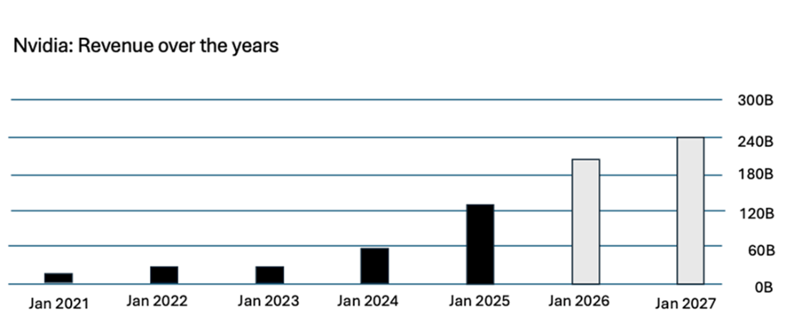
Nvidia's annual revenue, including estimates for 2025 and 2026 that were reported in January.
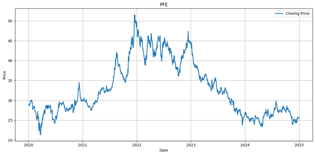
Pfizer shares provided no capital appreciation if you bought shares five years ago, which means that sometimes buying low and selling high does not always work out.
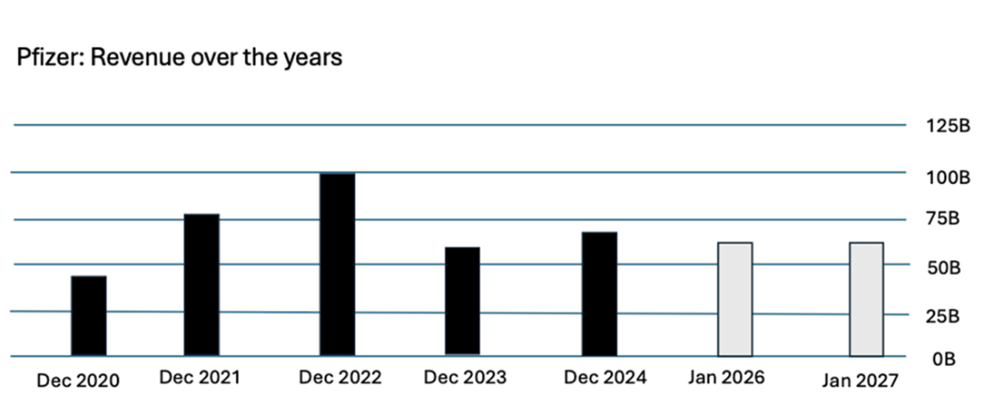
Pfizer had massive earnings during COVID-19, and once the pandemic was over, the earnings went back.
Four charts (Nvidia, Bitcoin, the 10-year USD T-Notes/T-Bond yield interest rate, and the US Dollar exchange rate to the Euro). Every chart tells a story, and we can assume what was happening.
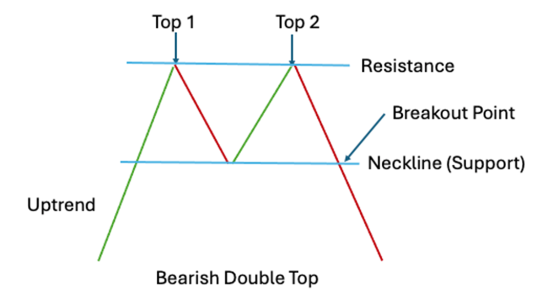
The bearish double top is a pattern that, after an uptrend, has two peaks before it goes down again. If traders identify this pattern in time, they can sell or buy accordingly.
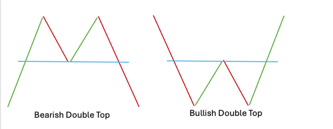
A bullish double top and its “twin”, the bearish double top. Investors looking up other chart patterns, such as the head and shoulders or rising wedge, will always find bullish or bearish patterns.
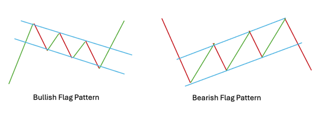
The bullish and bearish flag patterns are reference examples for continuation patterns. A temporary initial trend was reversed and continues again in the same direction.
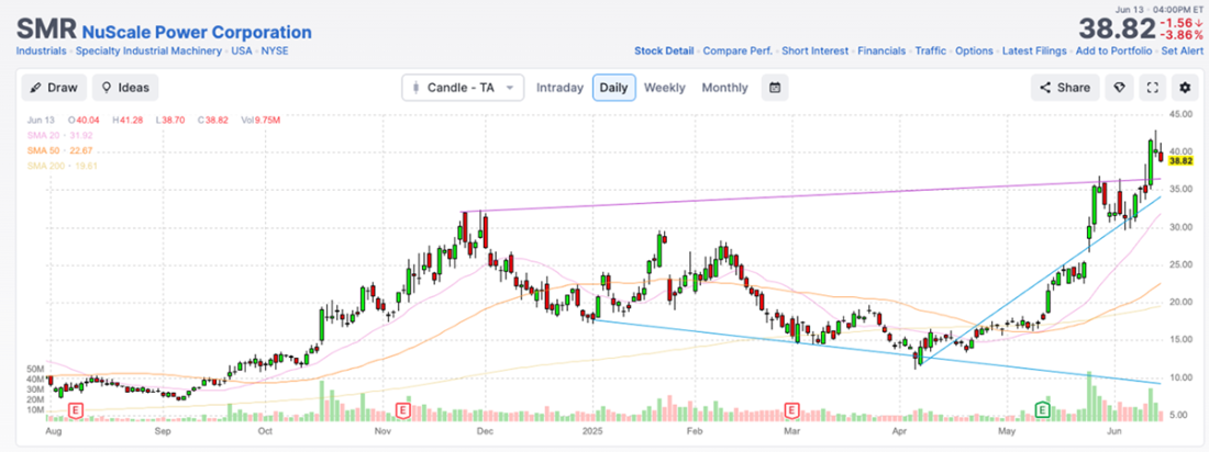
A NuScale(SMR) chart provided by FINVIZ.com shows how quickly we can perceive price movements over a longer time when the details are visualized.
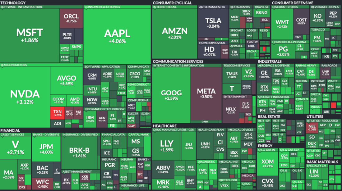
A tree map from Finviz gives us an idea about price movement. Please check out today’s chart (https://finviz.com/map.ashx) to get the latest data and get a better impression of how much you can read through the color scheme.
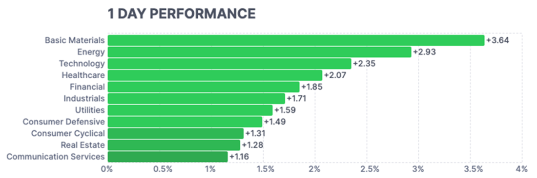
A bar chart showing the distribution of growth by sector within a day. Bar charts are effective for illustrating the distribution of elements within a group.
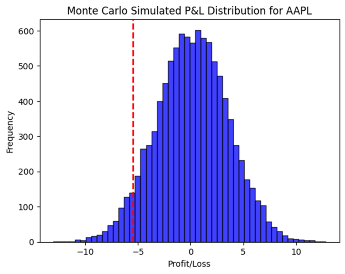
Shows a histogram of Apple’s returns over time, indicating that the returns of Apple follow a normal distribution, which, in other words, means not to worry about the stock’s performance.
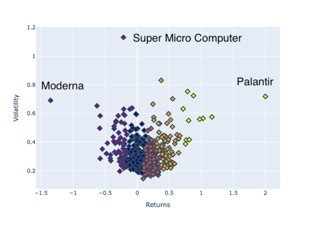
Illustrates a scatter plot that categorizes stocks by volatility and returns.
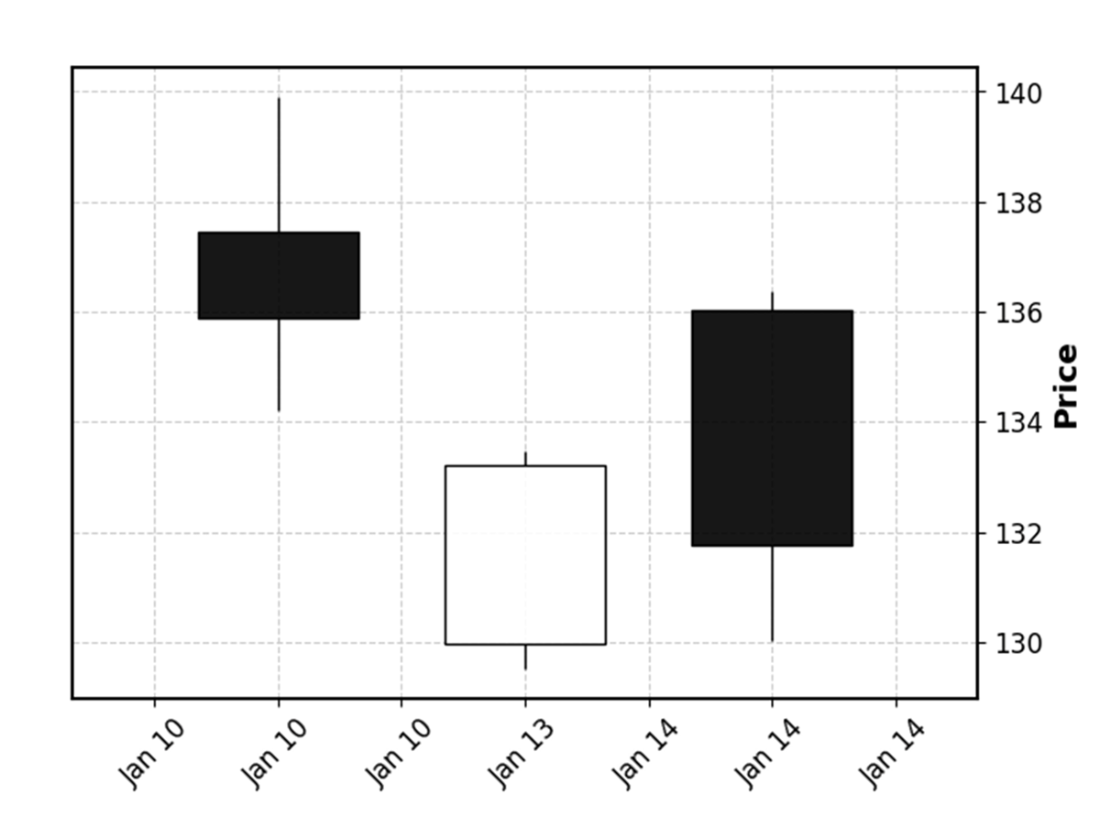
Shows a candlestick diagram referencing three trading days of Nvidia, from which we deduce price movements. Days 1 and 3 ended with a lower closing price than the opening price, and we can also see that on Day 3, the price was more volatile than on the preceding days.
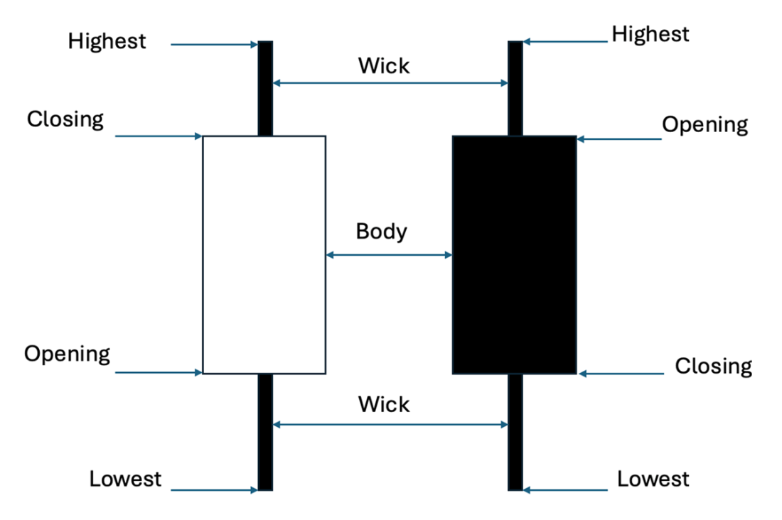
Shows the anatomy of a bullish(white) and bearish(black) candlestick.
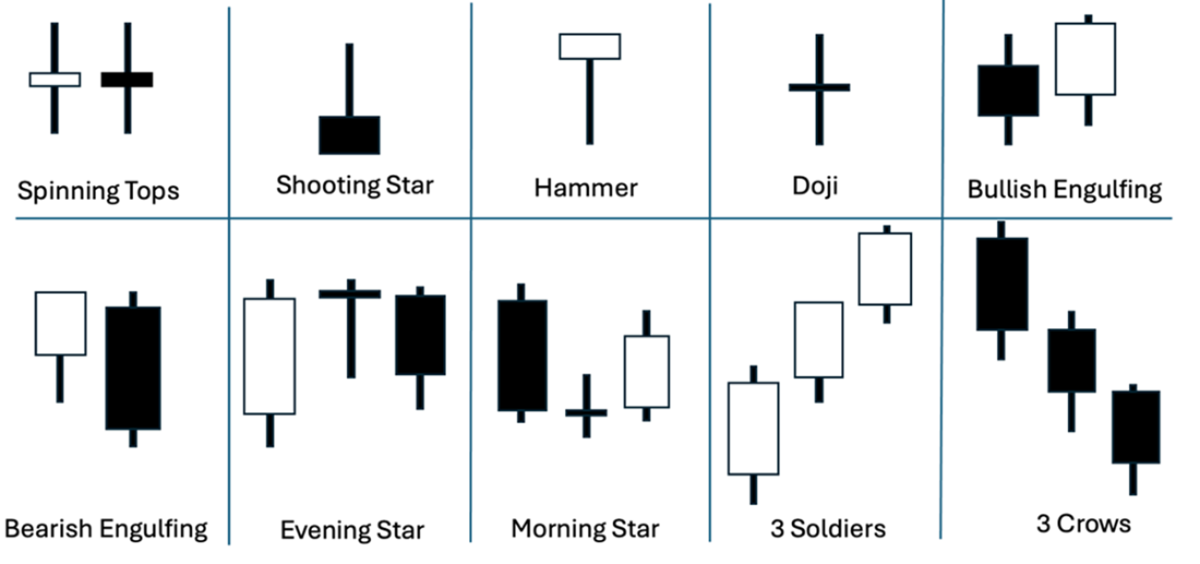
Various candlestick patterns in which we can describe the behavior of the market. In addition to the doji, hammer, and engulfing patterns, we can see the volatility of prices. You immediately realize that candles with long bodies represent high volatility, whereas candles with multiple short bodies represent a calm market situation.
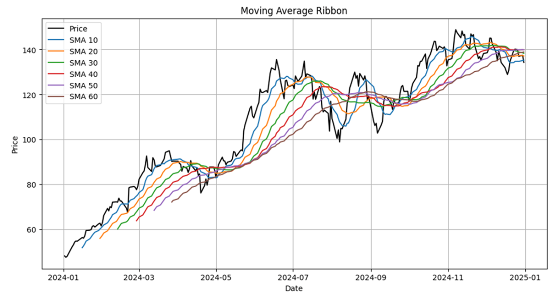
Shows moving average ribbons that contract around 2024-05 and 2024-10, indicating that the market was consolidating at that time.
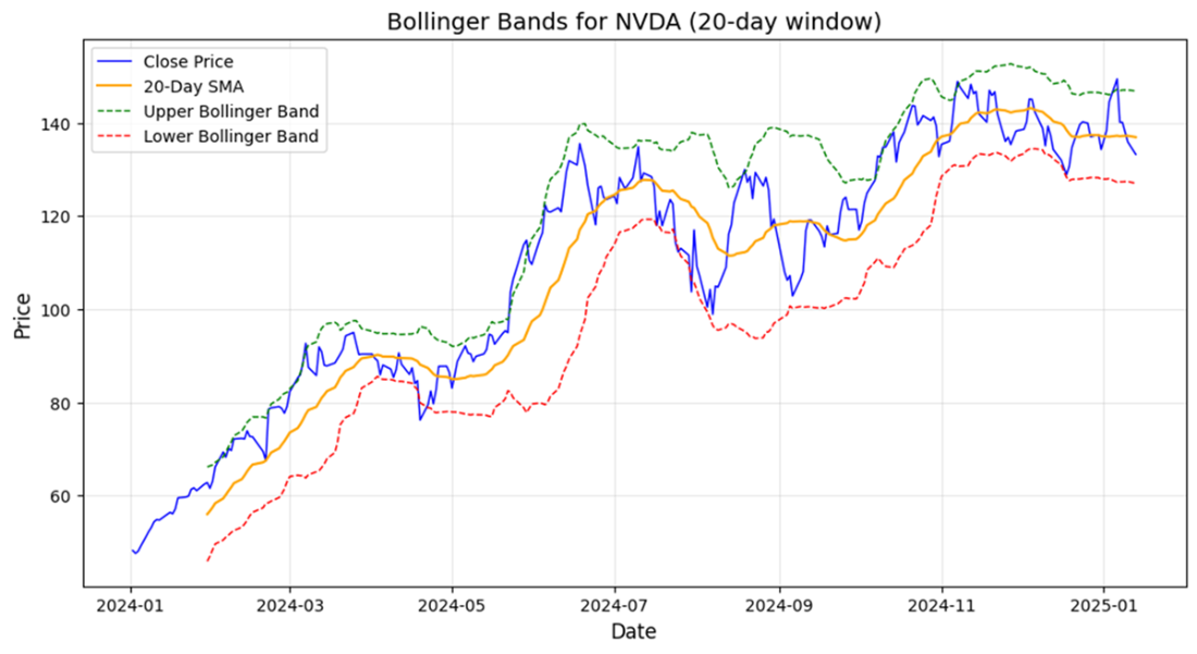
Shows the Bollinger Bands for Nvidia, providing insight into potential days to buy or sell shares.
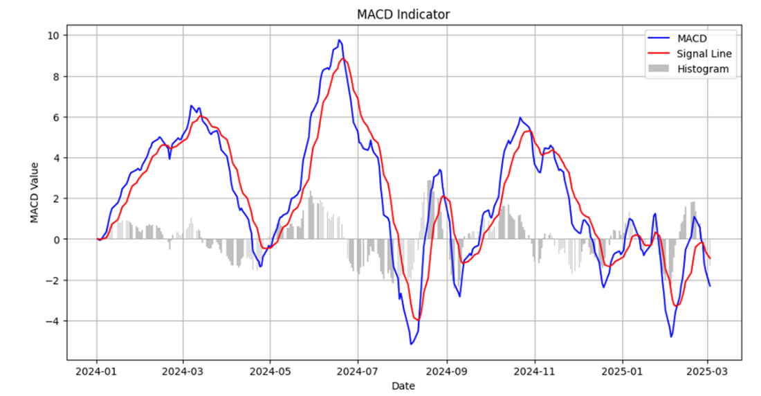
Shows the MACD for Nvidia closing prices. Whenever a signal line crosses the MACD, a trading signal is generated.
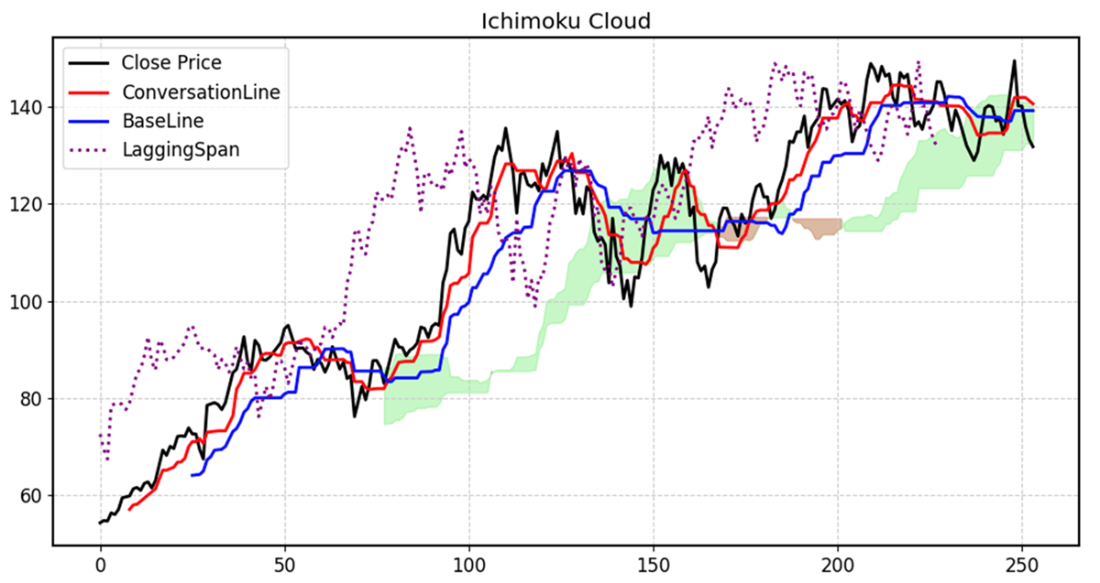
An Ichimoku for Nvidia closing prices indicating multiple bullish momenti.
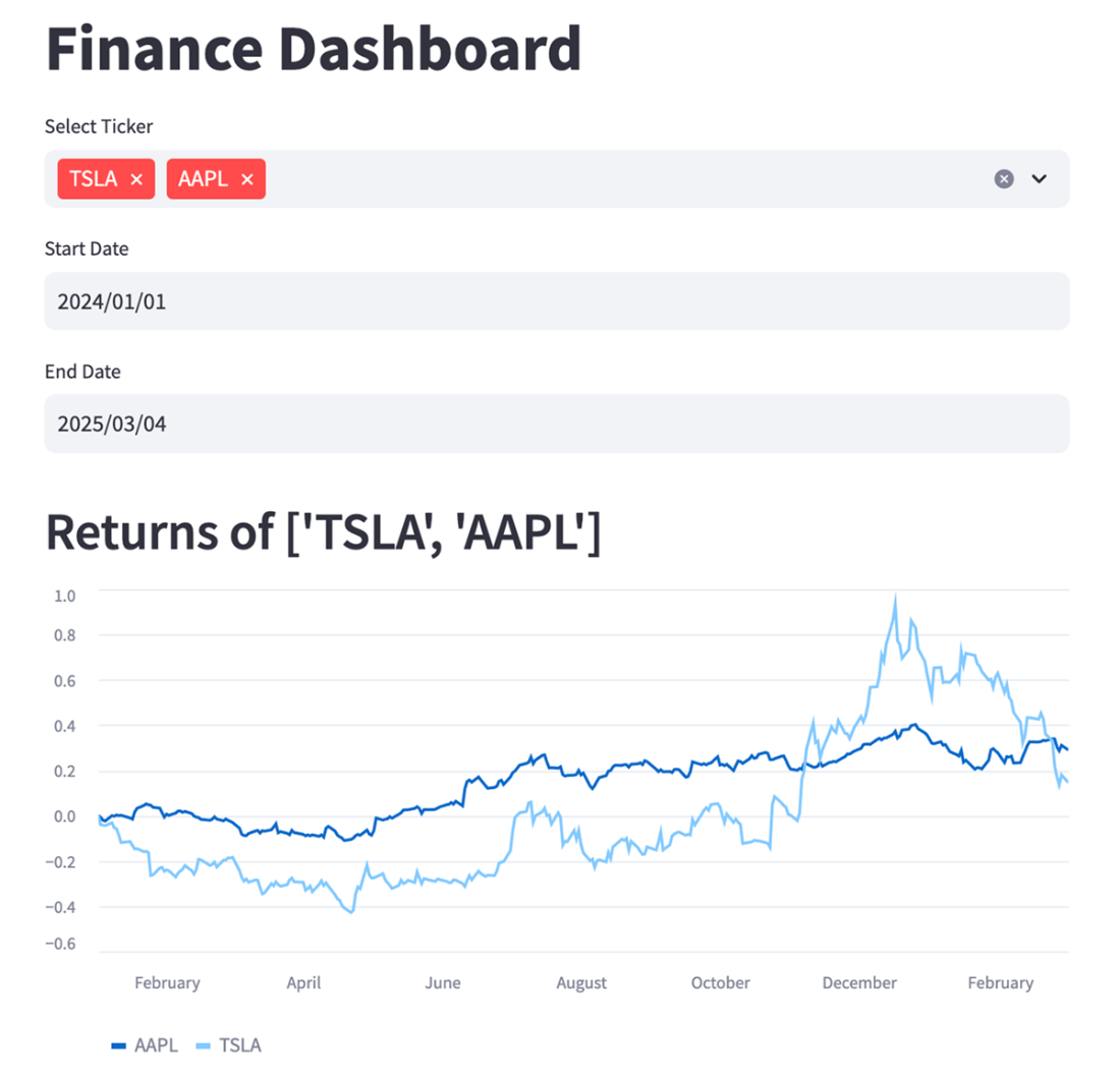
Displays the returns of Apple and Tesla in a chart rendered on a website by Streamlit.
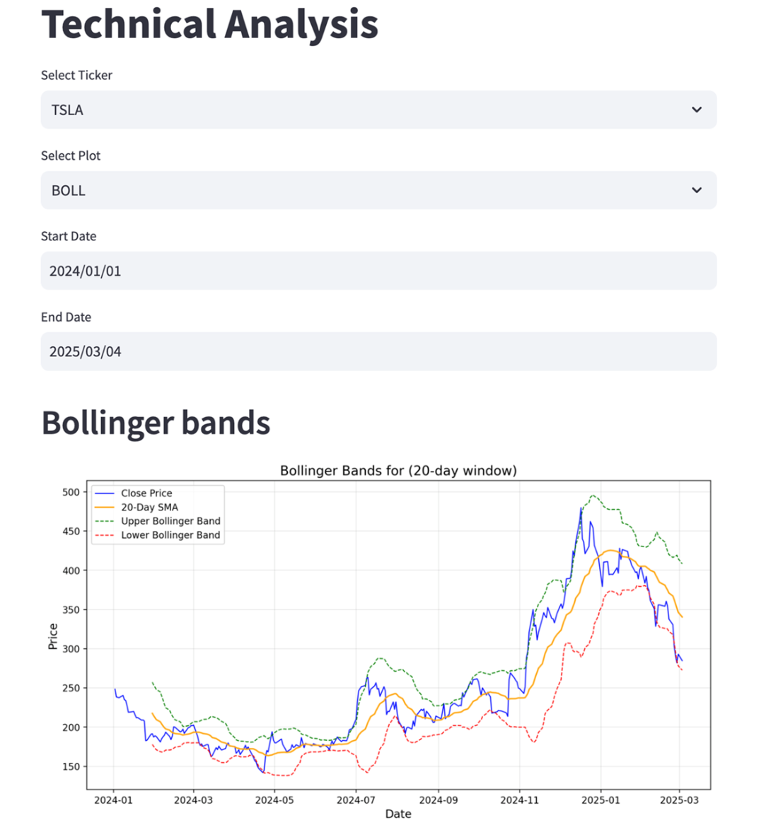
Shows a Streamlit web page displaying Bollinger Bands.
Summary
- Every chart tells a story. If you plot the share price development of an asset, you will also see the impact of catalysts— events that propel significant changes in asset prices.
- You need to put price movements into context. For some asset classes, you expect more or less volatility than for others.
- You can look for patterns in a chart to predict future development.
- Patterns, such as the double top, serve as a reference example. These patterns can reveal a trend, but identifying them can be tricky, as they are merely templates of the past.
- Chart patterns can be categorized into two main groups: reversals and continuations. The first follows a trend and then reverses it; the second continues to follow a trend.
- Treemaps of a full stock market, popularized by platforms such as Finviz, provide a comprehensive overview of all constituents within the stock market.
- Bar charts allow the display of the distribution of participants in a group. You can visualize the assets within an ETF weighted by their size.
- Histograms are ideal for plotting daily returns. If their returns follow a Gaussian distribution, everything is in order.
- Scatter plots can be used to detect specific assets within a group of assets.
- Candlesticks provide insights into market trends and movements during the period represented by a candle.
- A candlestick body represents the price difference between the security's opening and closing prices.
- The wicks of a candlestick identify the maximum and minimum price during a trading day.
- We can identify patterns across multiple trading days using candlesticks and name trends.
- Some prominent patterns in candlesticks that identify trends are Doji (opening and closing prices are almost the same), Hammer (possible reversal after a downtrend), and Engulfing (a substantial shift in momentum)
- You can calculate averages in many ways; some approaches weigh values differently.
- Use simple moving averages (SMAs) for long-term trend analysis.
- Use exponential moving averages (EMAs) for momentum and recent changes
- Use weighted moving averages (WMAs) for fast-moving signals
- Use Hull moving averages (HMAs) for lag reduction with smoothness
- Moving average ribbons are a way to plot multiple moving averages with different time windows over the closing price of a stock.
- If moving average ribbons contract, we can identify a consolidation in the share price.
- Use Bollinger Bands to analyze volatility and price extremes, as they can be easily detected when they cross the upper and lower bands plotted in the chart.
- MACD measures the relationship between two moving averages of a share price. Use MACD for momentum and crossovers.
- Traders look for crossovers in such charts, as they serve as trading signals to buy or sell stocks.
- Streamlit is an excellent way for Python programmers to visualize content on a web page without needing to learn web programming.
 Investing for Programmers ebook for free