7 Number go up! (or down) Correlation and linear regression
This chapter builds intuition for spotting and quantifying linear relationships, then turns that understanding into prediction. It introduces correlation as a single-number summary of how two variables move together, focusing on the Pearson correlation coefficient r (from -1 to 1) and its interpretation for positive, negative, and no linear association. Correlation is framed as a hypothesis test: the null posits no linear relationship (r = 0), and p-values quantify how surprising the observed r would be under that null, with sample size and data dispersion strongly affecting significance. The chapter emphasizes essential assumptions—linearity, continuous variables, approximate normality, homoscedasticity, no severe outliers, and independent observations—and repeatedly warns that correlation is not causation.
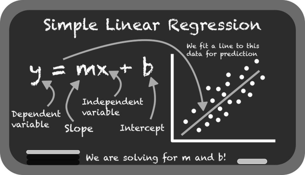
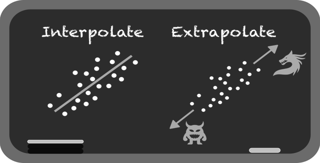
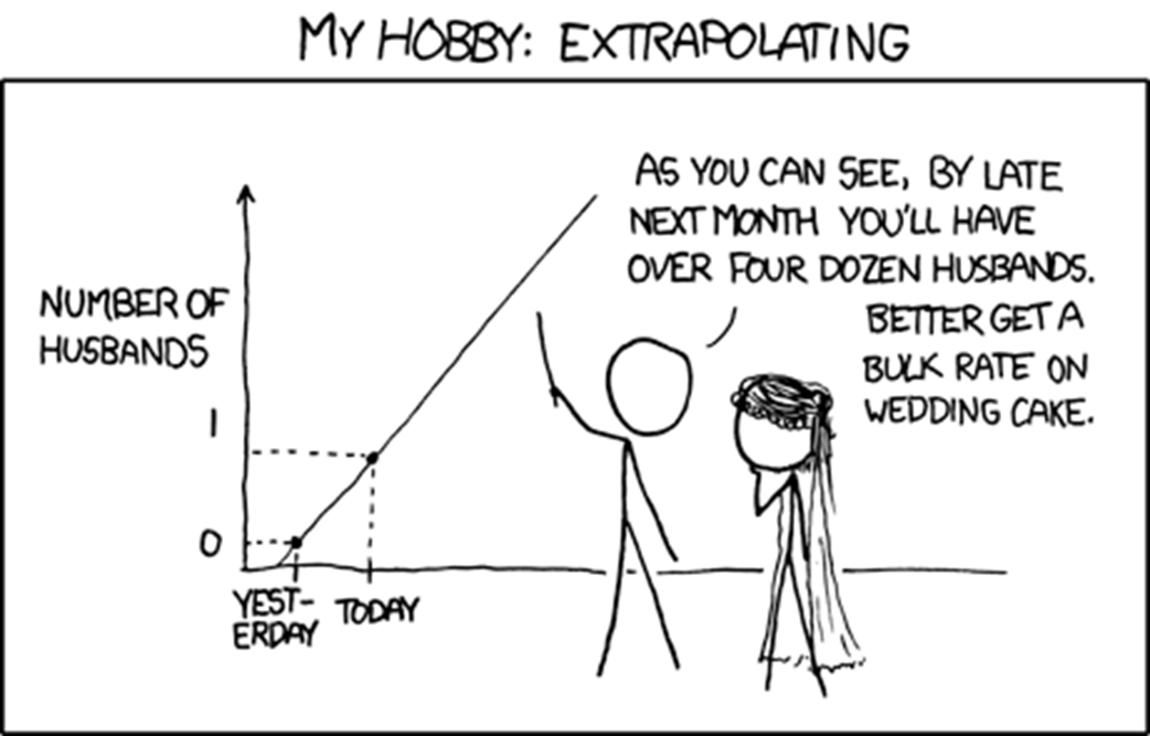
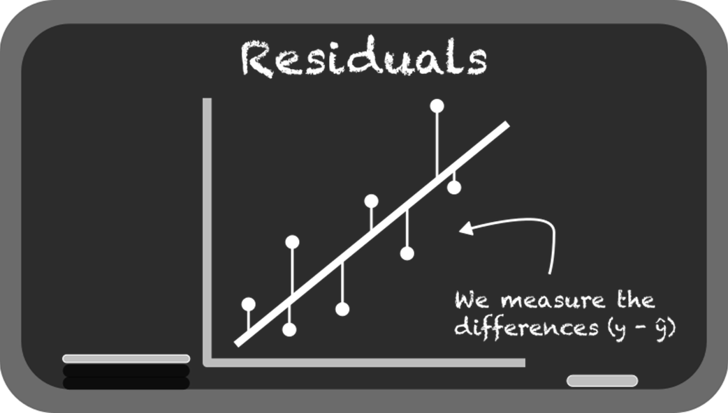
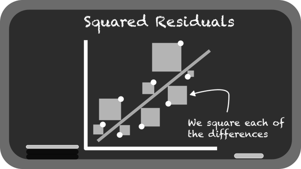
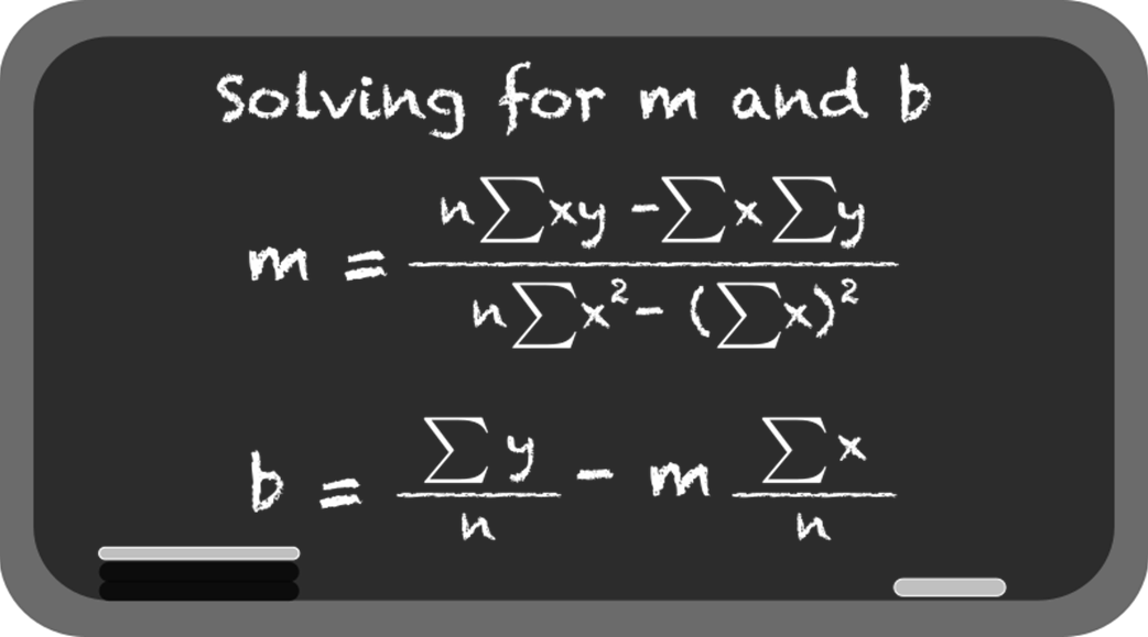
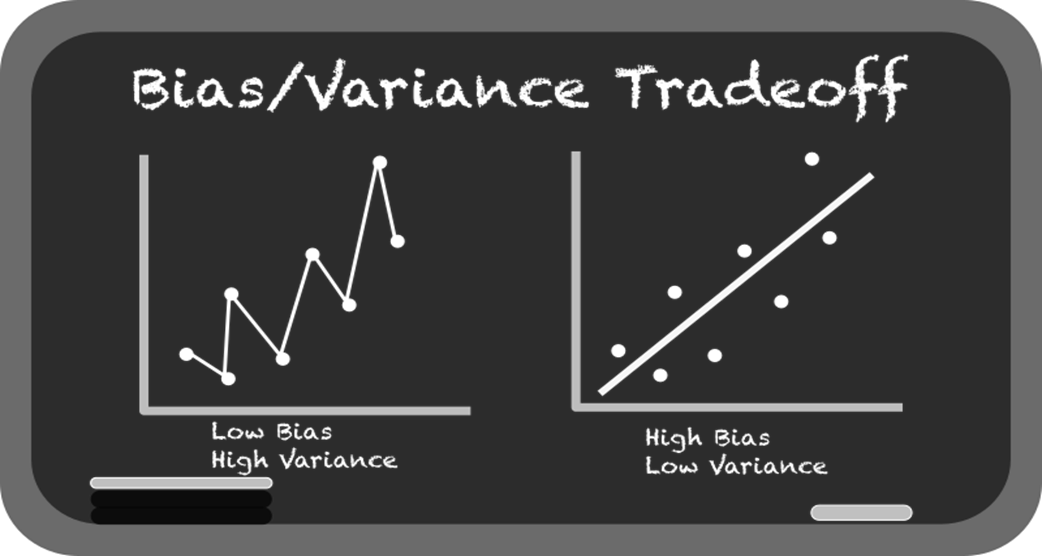
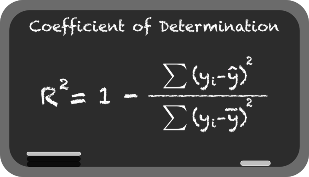
From association, the chapter moves to linear regression for prediction. It explains simple linear regression (y = mx + b), how libraries estimate slope and intercept, and how fitted lines are judged by residuals and the sum of squared errors. You learn core evaluation metrics—R² (as variance explained) and RMSE (as average error size)—and see why minimizing squared residuals underpins the “best-fit” line. The text also covers the dangers of extrapolation beyond the data’s range, the tendency of overly flexible models to overfit, and the bias-variance tradeoff that underlies model choice and generalization.
Practical guidance is woven through two examples. A small, clean sports-drink–temperature dataset illustrates strong linear signal, straightforward fitting, and interpretation. A real-world bird-strike analysis reveals common pitfalls: skewed counts, outliers, heteroscedasticity, the temptation (and limits) of binning and log transforms, and the necessity of plotting data and checking assumptions before trusting statistics. The chapter closes by situating linear regression within a broader toolkit—extending to multiple predictors and beta coefficients—while reinforcing disciplined practice: use domain knowledge, validate assumptions, prefer interpolation over extrapolation, evaluate models with appropriate metrics, and never mistake correlation for causation.
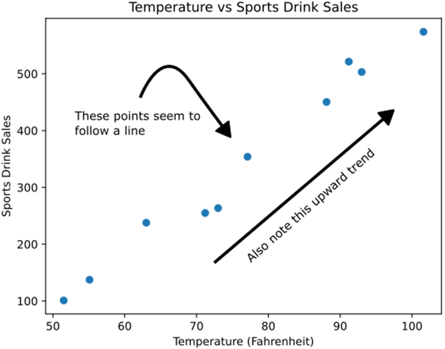
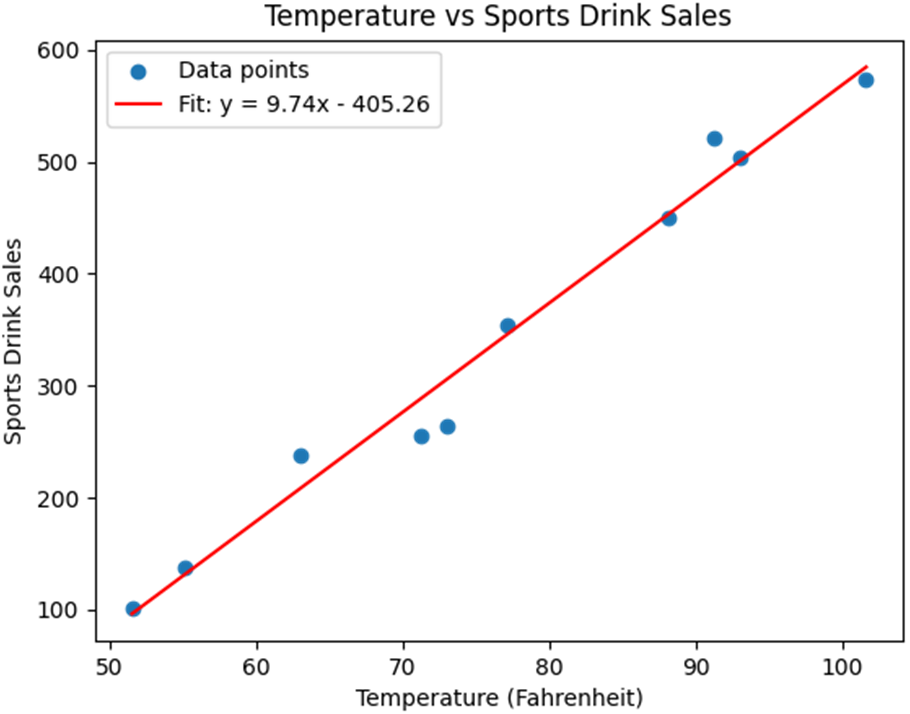
A scatterplot showing 10 data points of weather temperature to sports drink sales. Note the points seem to follow a “line” and have an upward trend pattern as temperature increases, so do sales.
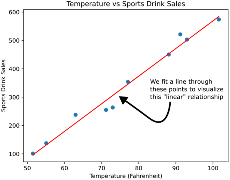
Fitting a line through these data points to visualize a linear relationship in the data.
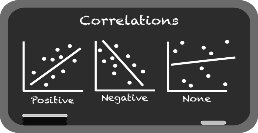
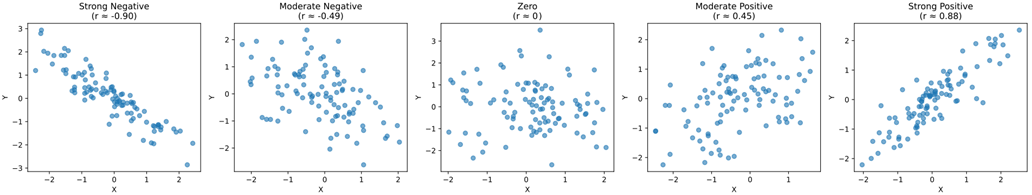
Different Pearson correlation values with different datasets. Note carefully how a strong positive (close to 1) or negative correlation (close to -1) has data more closely resembling a line.
Different Pearson correlation values and p-values. Notice how the sample size and dispersion of the data affect the p-value.

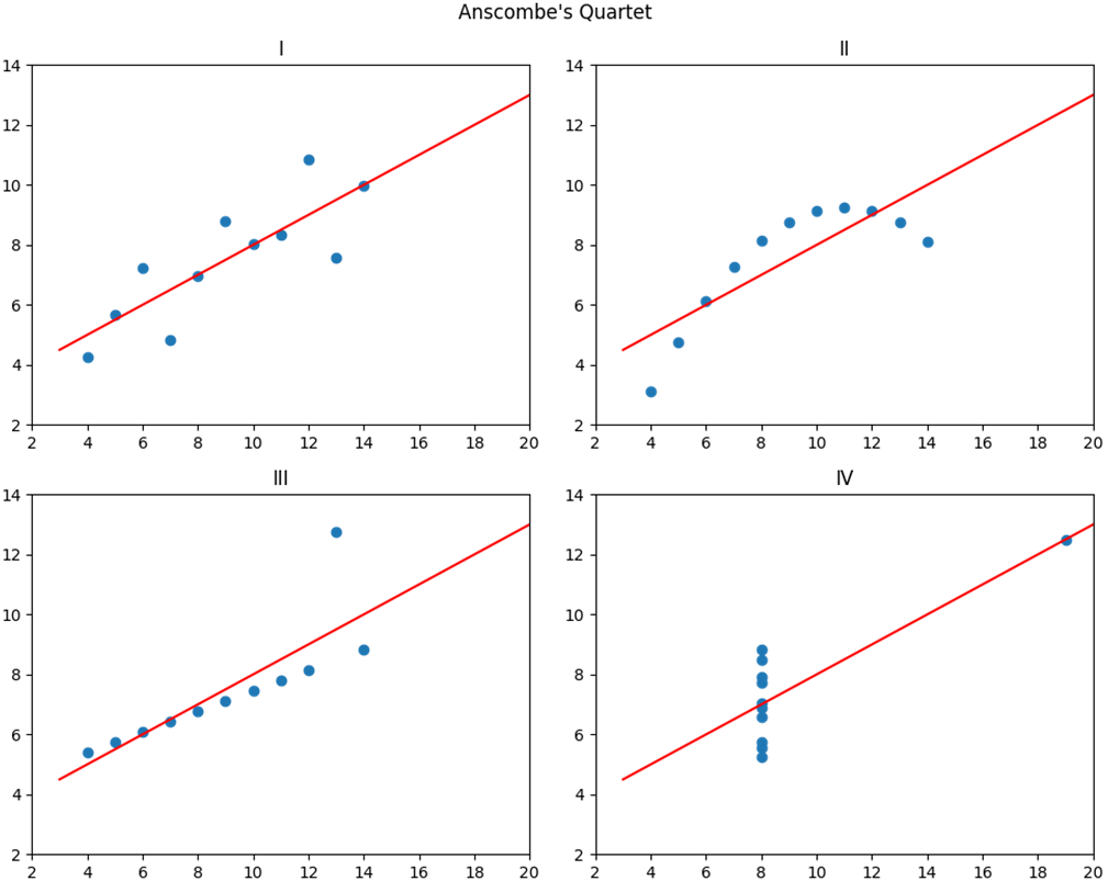
Anscombe’s Quartet (https://matplotlib.org/stable/gallery/specialty_plots/anscombe.html), showing four different datasets that have the same correlation coefficient and linear regression, and yet have very different shapes.
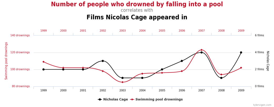
Tyler Vigen’s database of spurious correlations includes a finding that the number of people who drowned by falling into a pool correlates with the number of films Nicolas Cage has appeared in.
Using matplotlib to show a linear regression against our data.
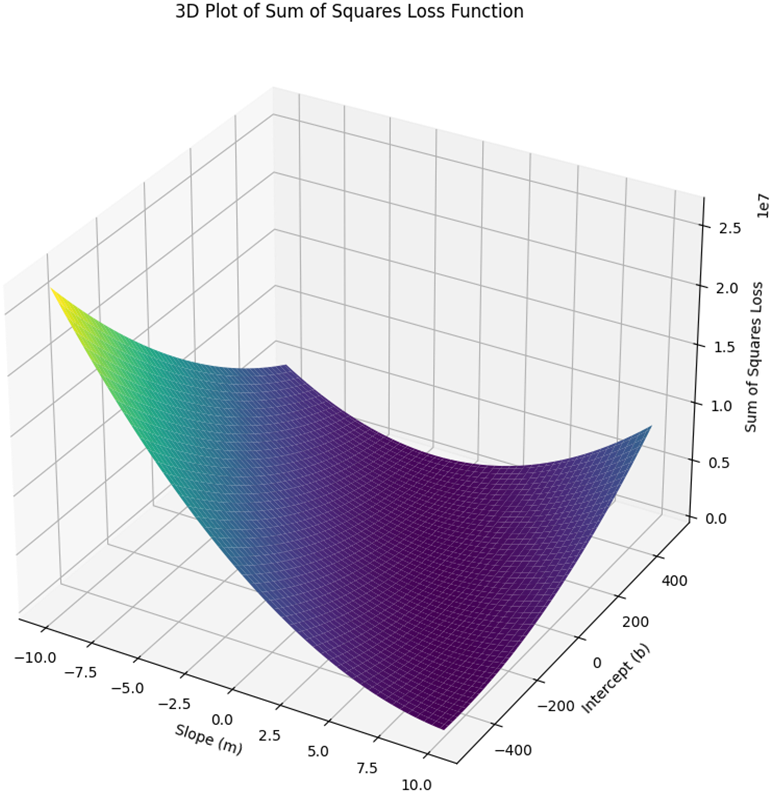
The 3D plot showing the sum of squares for different m and b values. We are trying to find the m and b values that are the lowest point in this valley.


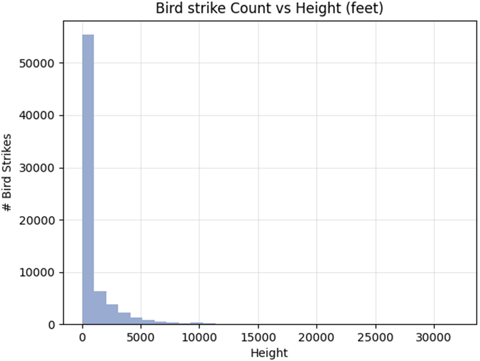
A histogram of airplane height vs number of bird strikes
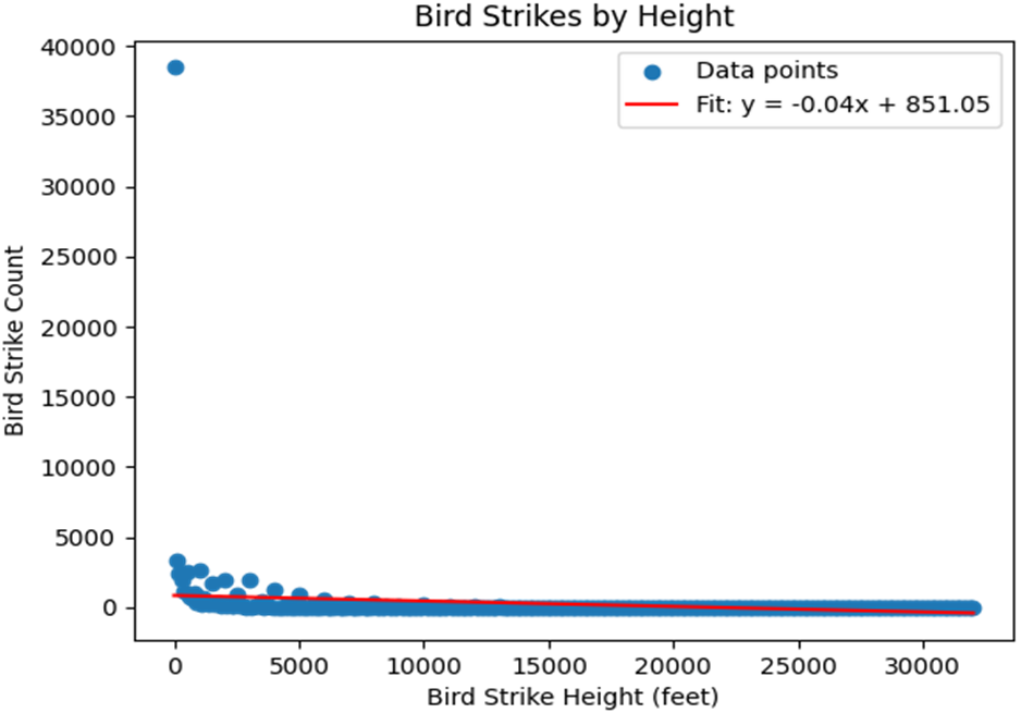
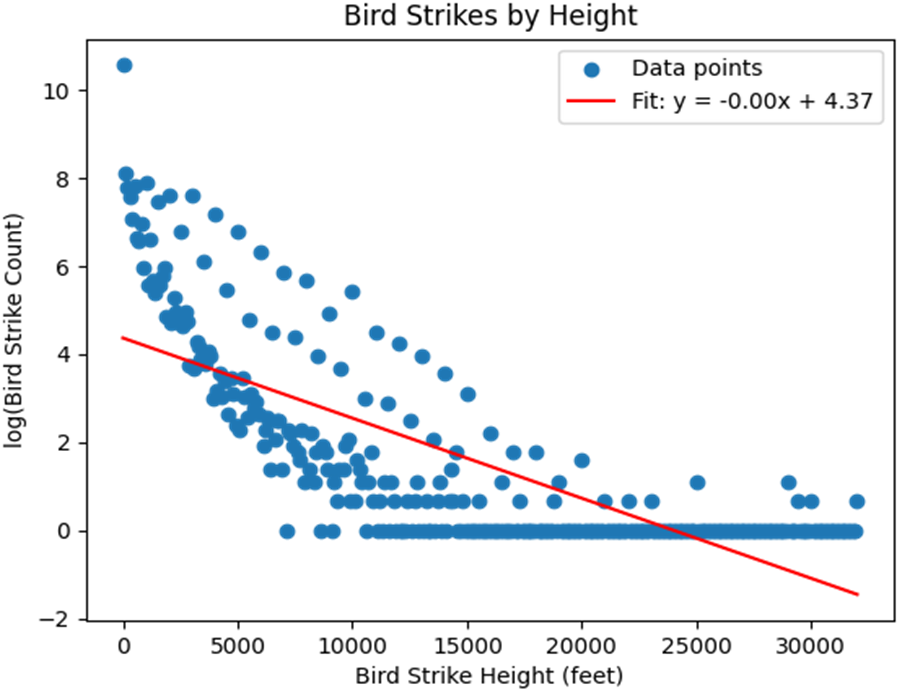
Bird strike incidents binned by 100-foot increments for HEIGHT, and applying a linear regression.
Reference
FAQ
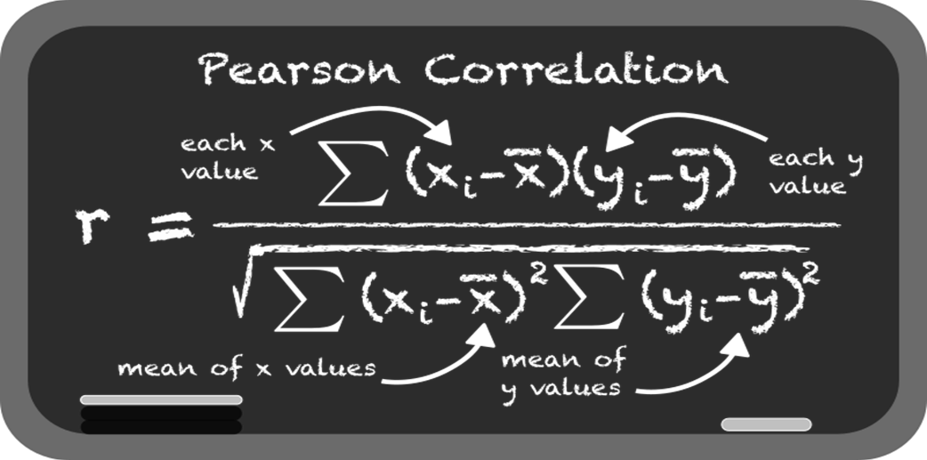
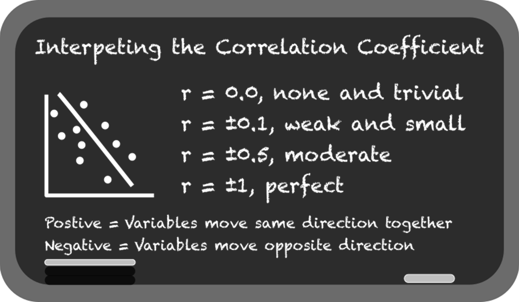
What is the Pearson correlation and how do I interpret r?
The Pearson correlation (r) quantifies the strength and direction of a linear relationship between two continuous variables. It ranges from -1 to 1: values near 1 indicate a strong positive linear relationship, values near -1 indicate a strong negative linear relationship, and values near 0 indicate little to no linear relationship. The closer |r| is to 1, the more closely points align to a straight line.Does a high correlation imply causation?
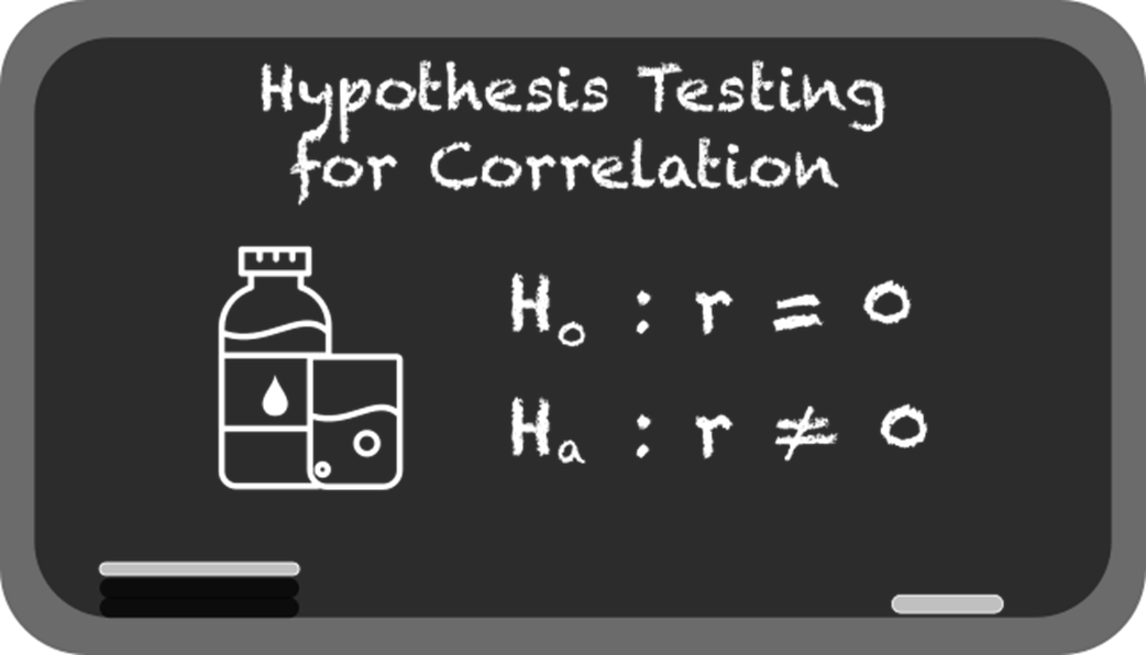
No. Correlation is not causation. Even a large |r| with a tiny p-value does not prove that X causes Y (or vice versa). Hidden variables (confounders) or coincidences can create spurious correlations. Establishing causation typically requires experimental design, new data, and domain context.How do I test whether a correlation is statistically significant?
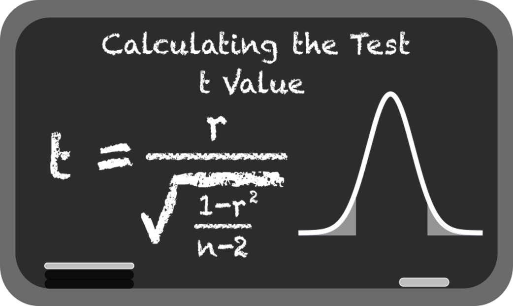
Formally, you test H0: r = 0 (no linear correlation) versus H1: r ≠ 0. Most tools (e.g., SciPy’s pearsonr) return both r and a p-value. Under H0, a t-test with n - 2 degrees of freedom is used. Smaller p-values indicate it is unlikely to see an r as extreme by chance if there were no correlation. Sample size matters: larger n can make modest correlations significant; tiny n can leave even large r values non-significant.What assumptions does the Pearson correlation require, and what if they’re violated?
Key assumptions:- Linearity (relationship is approximately straight-line).
- Continuous variables (not purely categorical/binary).
- Approximate normality of each variable.
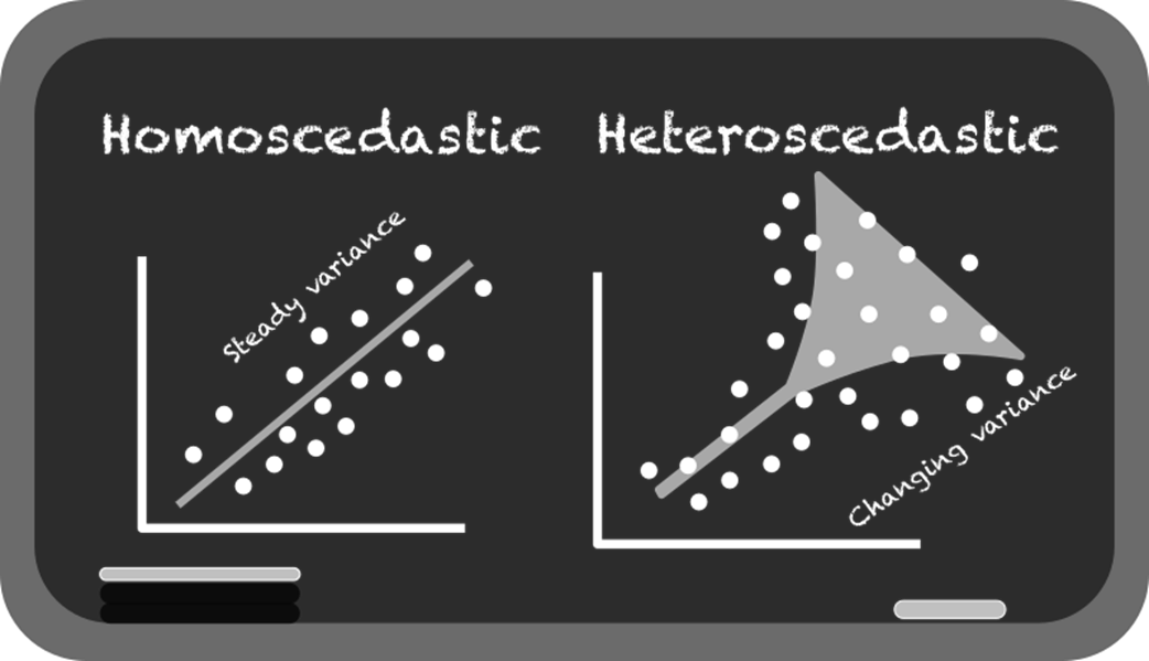
- Homoscedasticity (roughly constant spread across x).
- No severe outliers and independent observations.
 Grokking Statistics ebook for free